Menu buttons
Menu buttons, including menu buttons, combo buttons, and overflow menus, open a menu with a list of interactive options.
- Live demo
- Overview
- Formatting
- Content
- Universal behaviors
- Menu button
- Combo button
- Overflow menu
- Related
- References
- Feedback
Live demo
This live demo contains only a preview of functionality and styles available for this component. View the full demo on Storybook for additional information such as its version, controls, and API documentation.
Accessibility testing statusFor every latest release, Carbon runs tests on all components to meet the accessibility requirements. These different statuses report the work that Carbon has done in the back end. These tests appear only when the components are stable.
For every latest release, Carbon runs tests on all components to meet the accessibility requirements. These different statuses report the work that Carbon has done in the back end. These tests appear only when the components are stable.
Overview
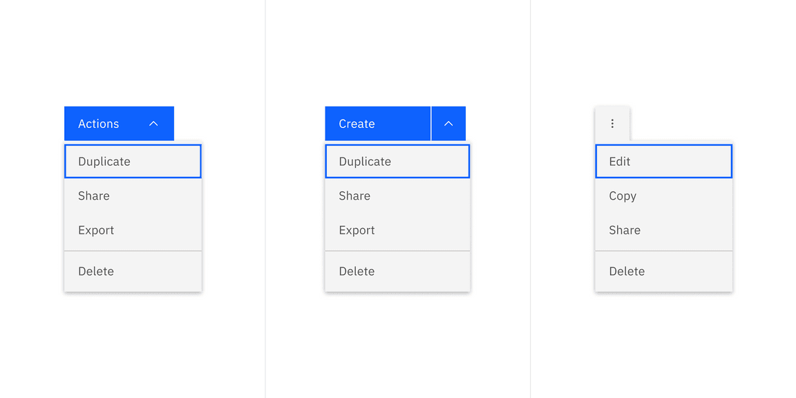
There are three variants of menu buttons (or menu triggers): menu button, combo button, and overflow menu button. Menu buttons are comprised of a button and a menu, which can be clicked to trigger an action or selected to initiate an action from a menu.
When to use
Hiding extra actions in limited screen space
Menu button, combo button, and overflow menu are useful when you need to show numerous options but have limited screen space available to display them. By hiding less frequently used or advanced options until the user needs them, it avoids cluttering the main interface with too many options.
| Variant | Purpose |
|---|---|
| Menu button | Use a menu button when all actions in the menu list share the same level of importance. They are usually used in the page header. |
| Combo button | Use a combo button when screen real estate is limited and one of the actions has particular importance. They are usually used in the page header. |
| Overflow menu | Use an overflow menu when additional options are available to the user and there is a space constraint. They are usually used in rows or cards. |
Formatting
Anatomy
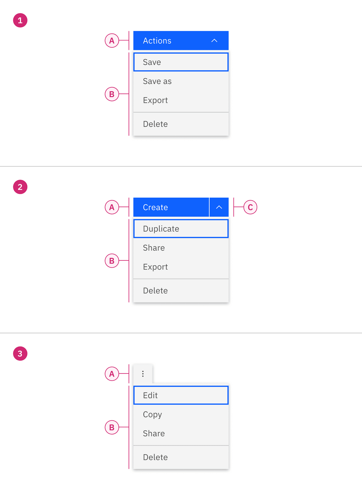
1. Menu button
A. Primary button
C. Menu
2. Combo button
A. Primary button
B. Icon button
C. Menu
3. Overflow menu
A. Icon button
C. Menu
Sizing
Height
Menu items come in four sizes: extra small, small, medium, and large. See more about size specifications on the style tab. When using a menu button trigger, the height of the menu item (singular) reflects the size of the button being used.
| Size | Height (px / rem) |
|---|---|
| Extra small | 24 / 1.5 |
| Small | 32 / 2 |
| Medium | 40 / 2.5 |
| Large | 48 / 3 |
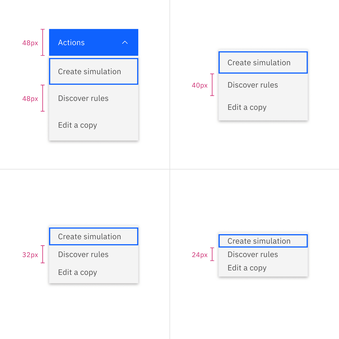
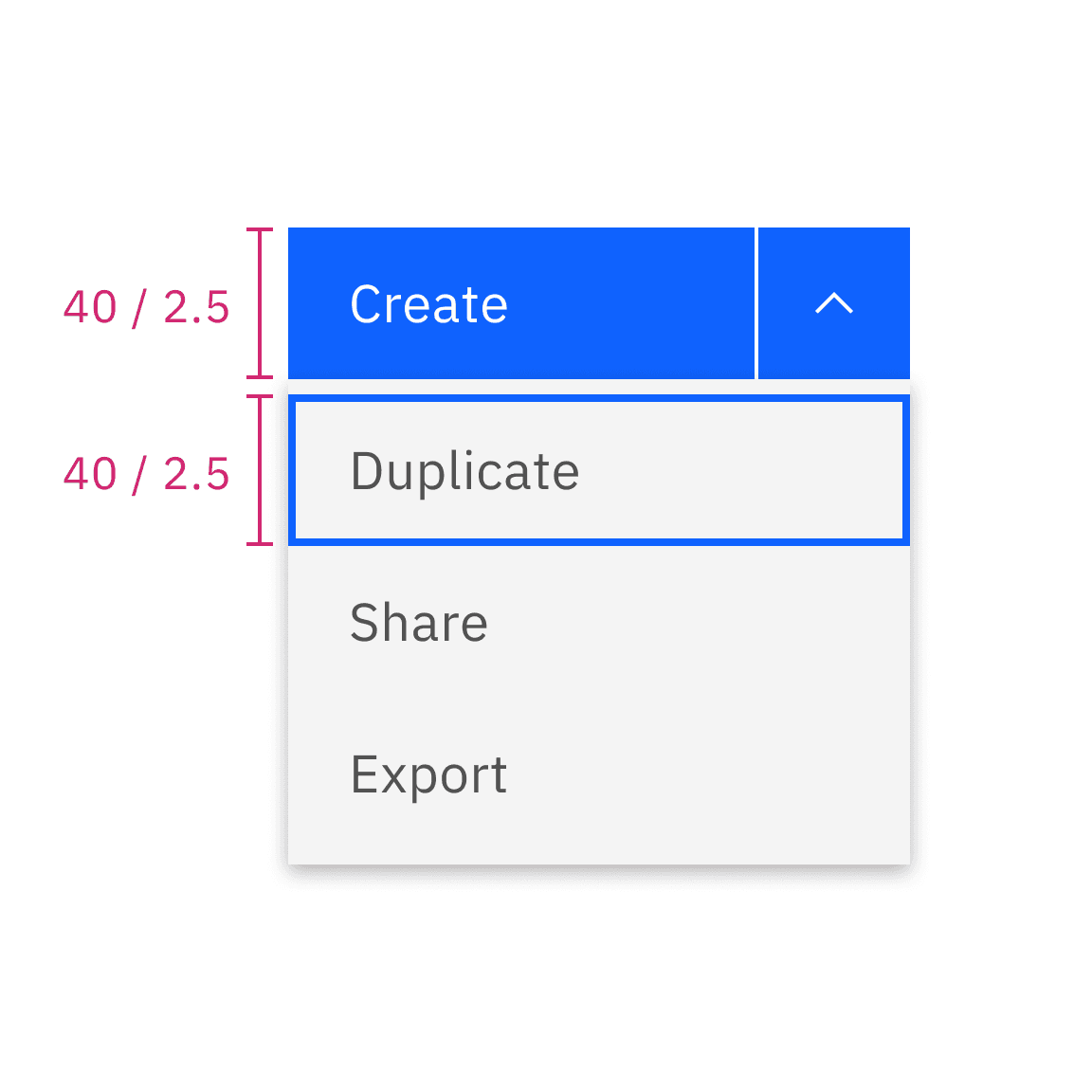
Do match the height of the menu buttons and the menu
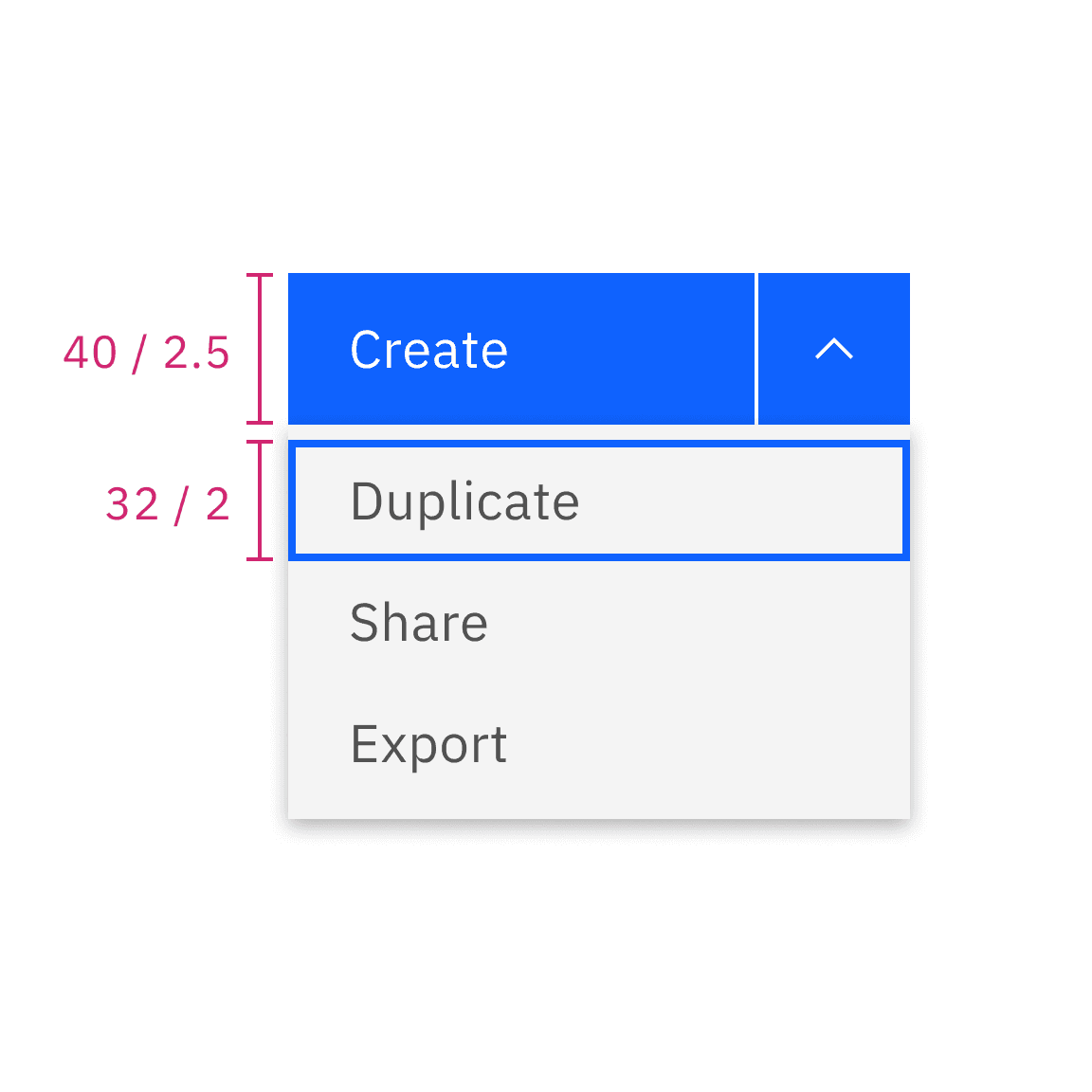
Do not mix the height of the menu buttons and the menu
Width
By default, the menu button and combo button follow the button structure style, and the menu maintains a minimum width of 160px to prevent a narrow appearance.
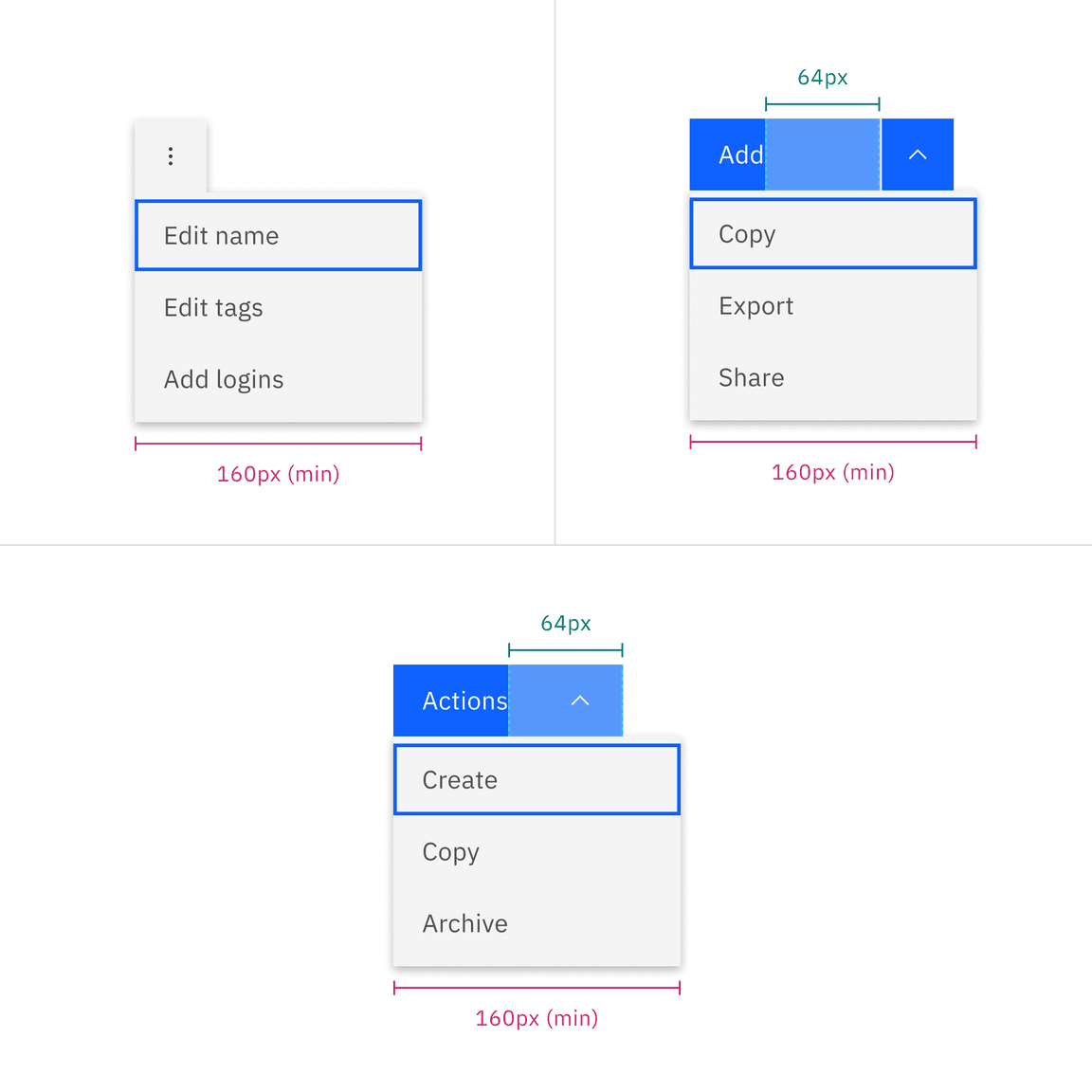
Menu default width when both button label and menu option labels are short
If the menu item labels become longer, the menu button and combo button remain the same size while the menu component can expand up to a maximum of 288px. Conversely, if the button labels become longer, the menu component should not appear narrower but should extend to match the width of the menu buttons.
If you opt for fluid-width default buttons, both the menu button (or the combo button) and the menu should have the same width.
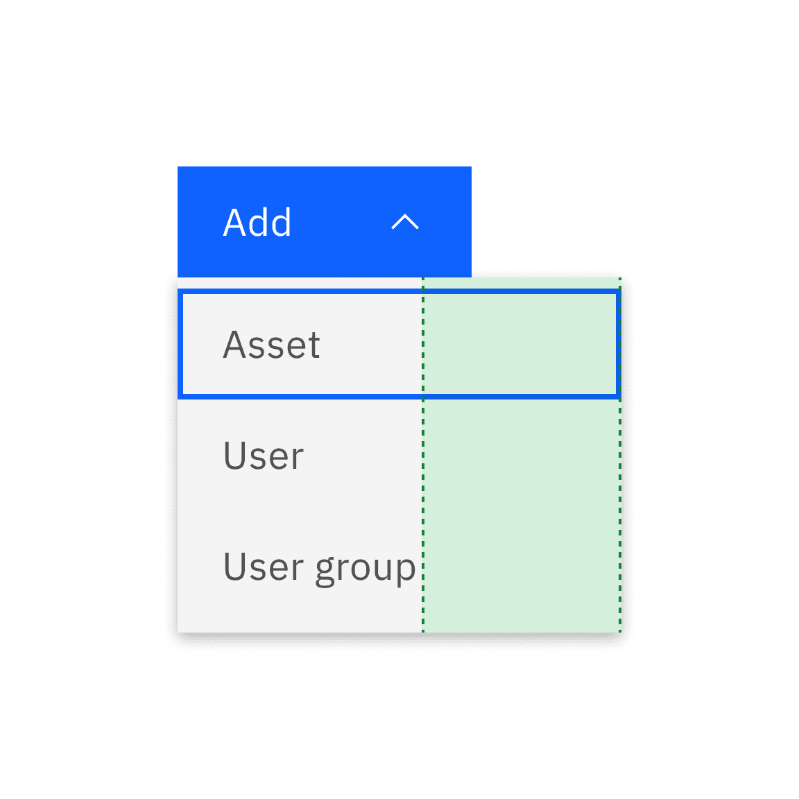
Do use the minimum width
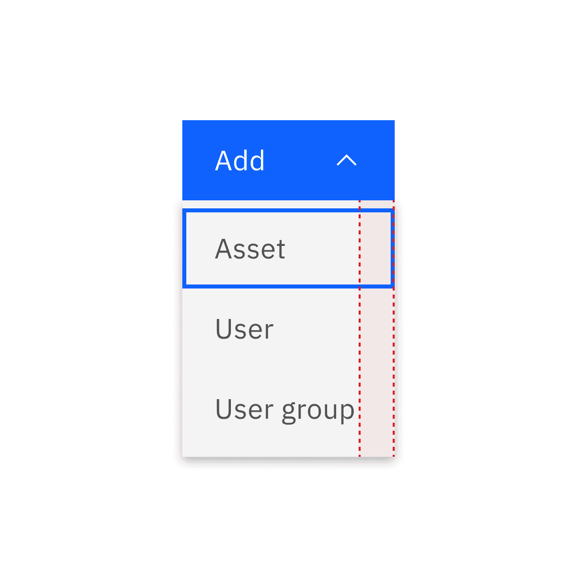
Do not narrow the menu to fit with other elements
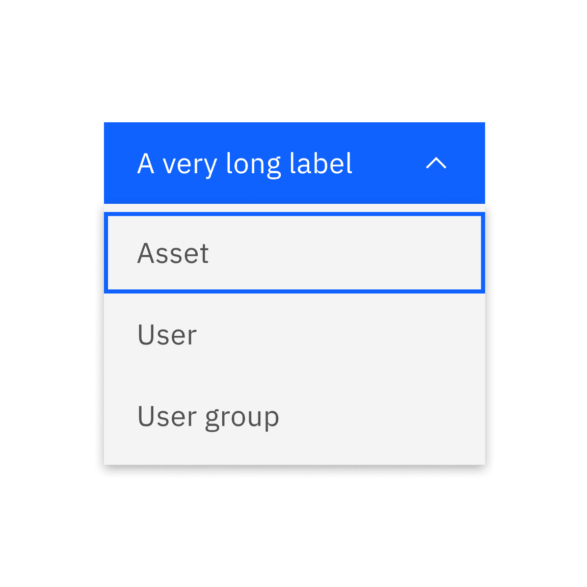
Do match the width when the menu or combo button label becomes longer
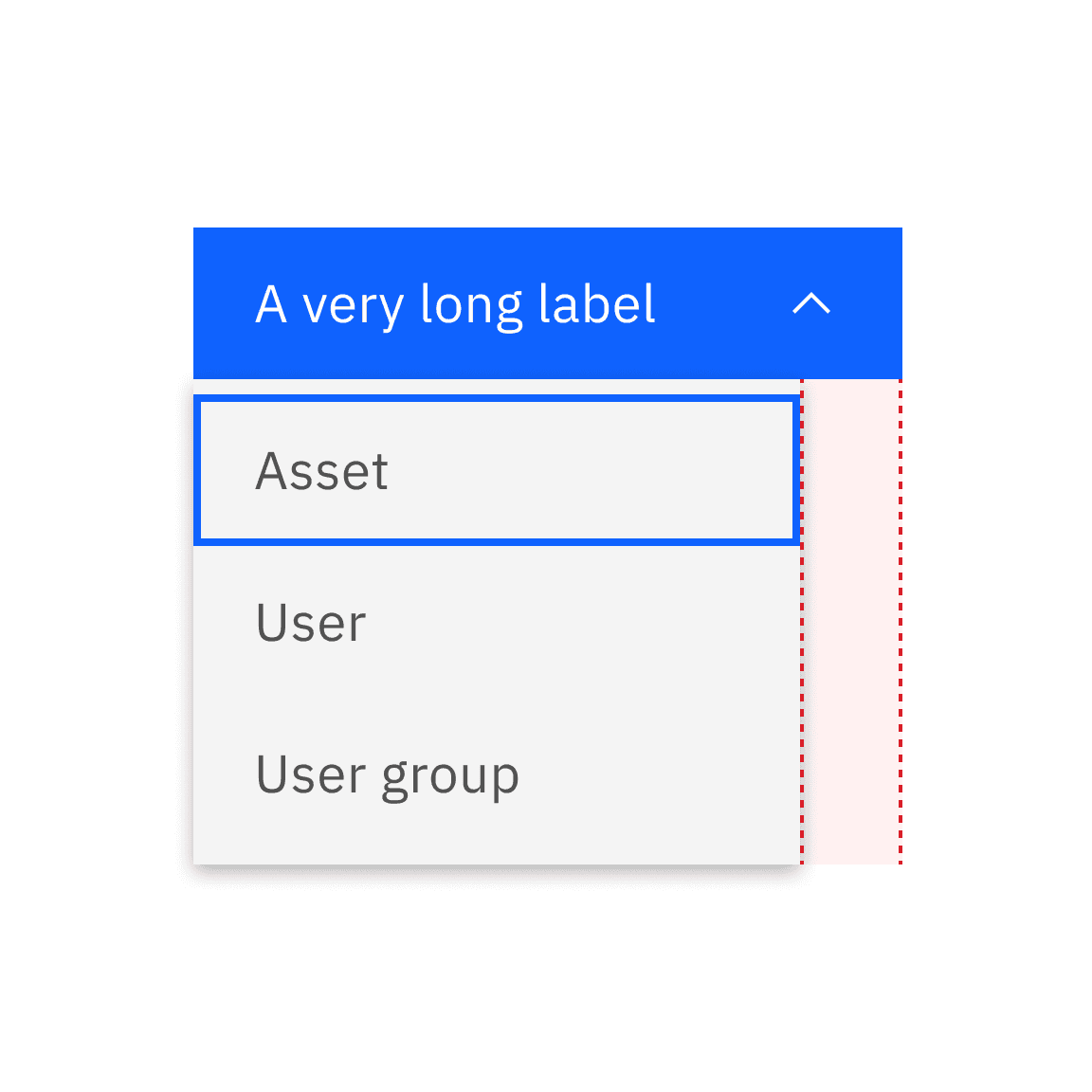
Do not make the menu appear shorter than the menu or combo buttons
Ghost buttons only adhere to the button style. This is because enlarging the ghost button’s width to match the menu’s width would result in the caret appearing disconnected from its associated button, especially when the menu button is in its closed state.
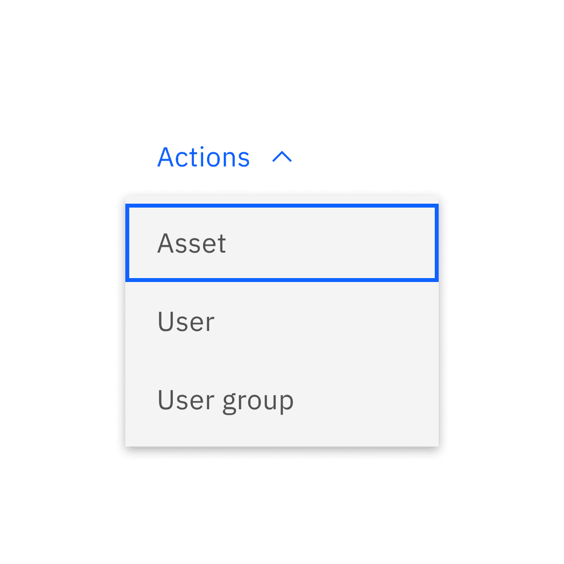
Do use default ghost button in all cases
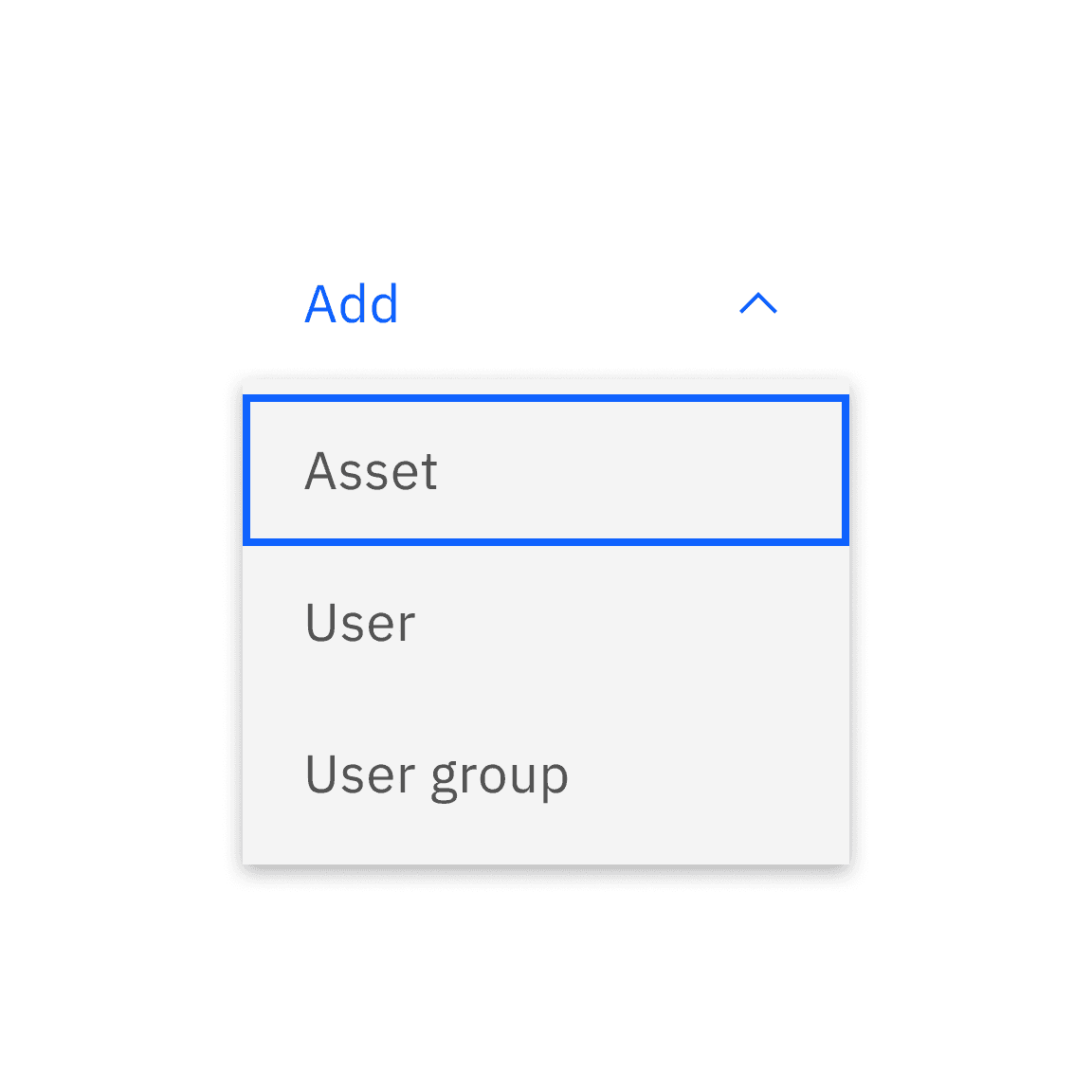
Do not use fluid ghost button in any cases
Alignment
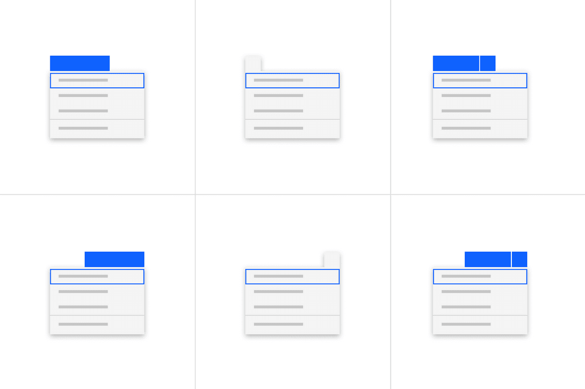
Default
By default, combo button, menu button, or overflow button remains positioned at the top, to the left or right side of the menu when it is open, depending on the available space and layout.
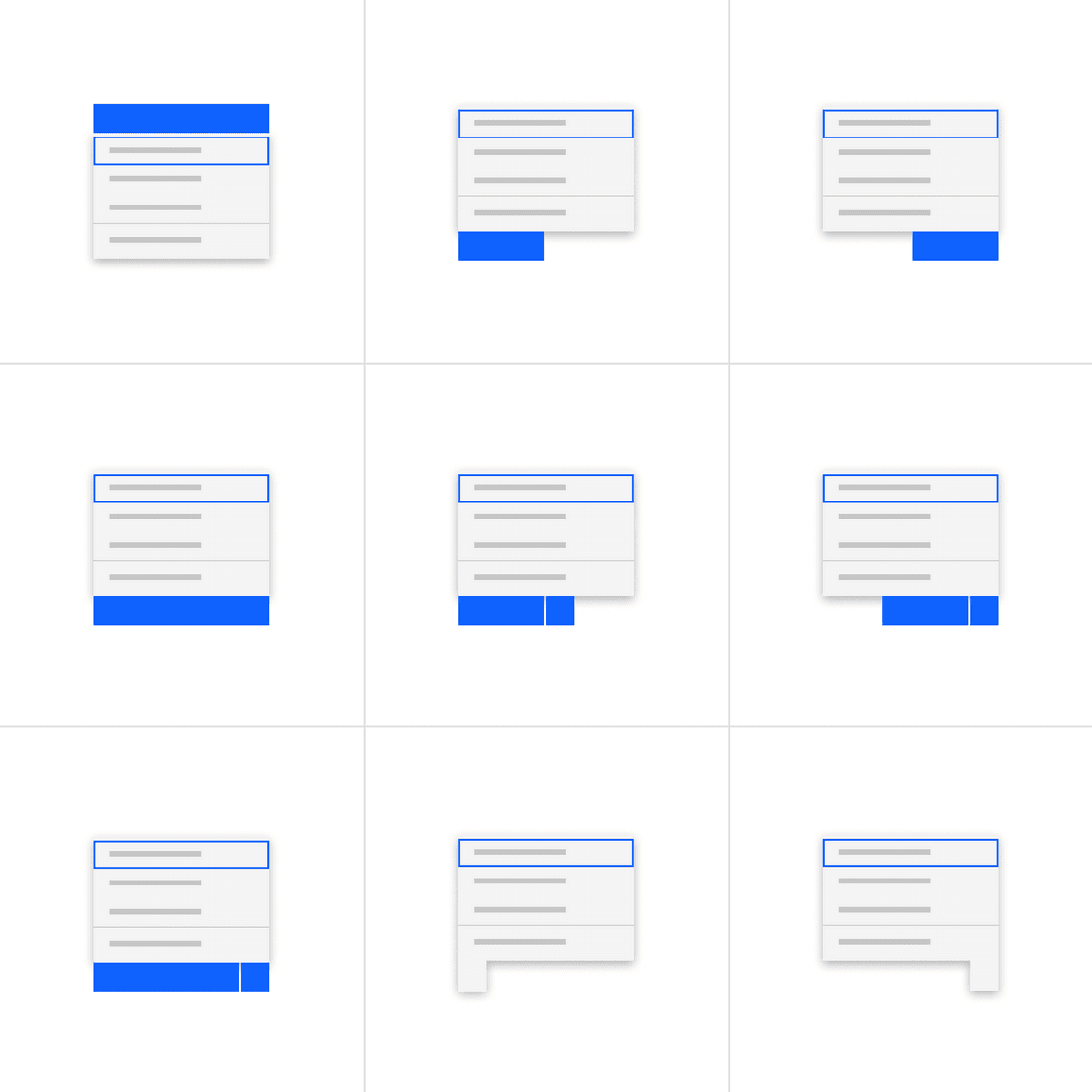
Alternatives
Alternatively, open menus can be positioned at the bottom, to the left or right of its associated menu button trigger, depending on the available space and layout.
Placement
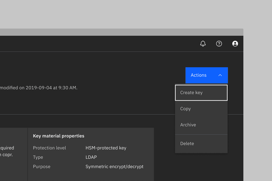
Menu and combo buttons
These buttons are ideal for page headers, where multiple, distinct actions may impact the page content, and where real-estate is limited. In the page header component, multiple buttons will become a single action button at smaller screen sizes. These buttons should only be used when the actions affect a full page or a large object on a page (examples include a canvas UI, diagram, or whole data table).
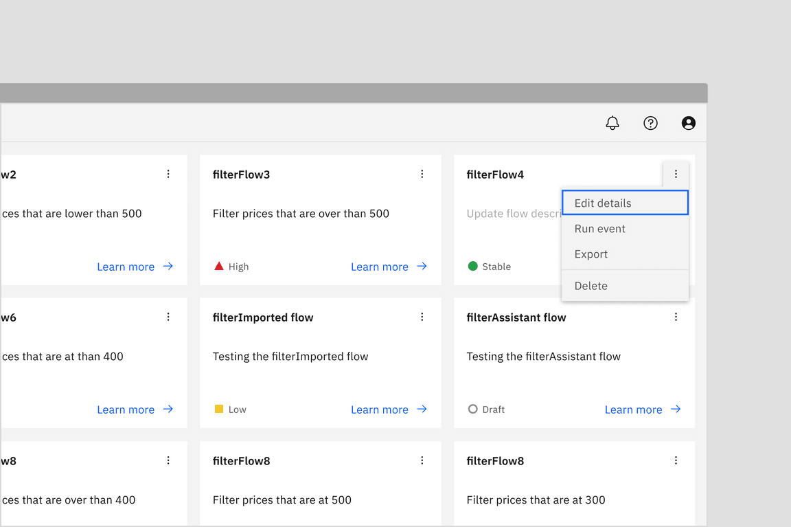
Overflow menu
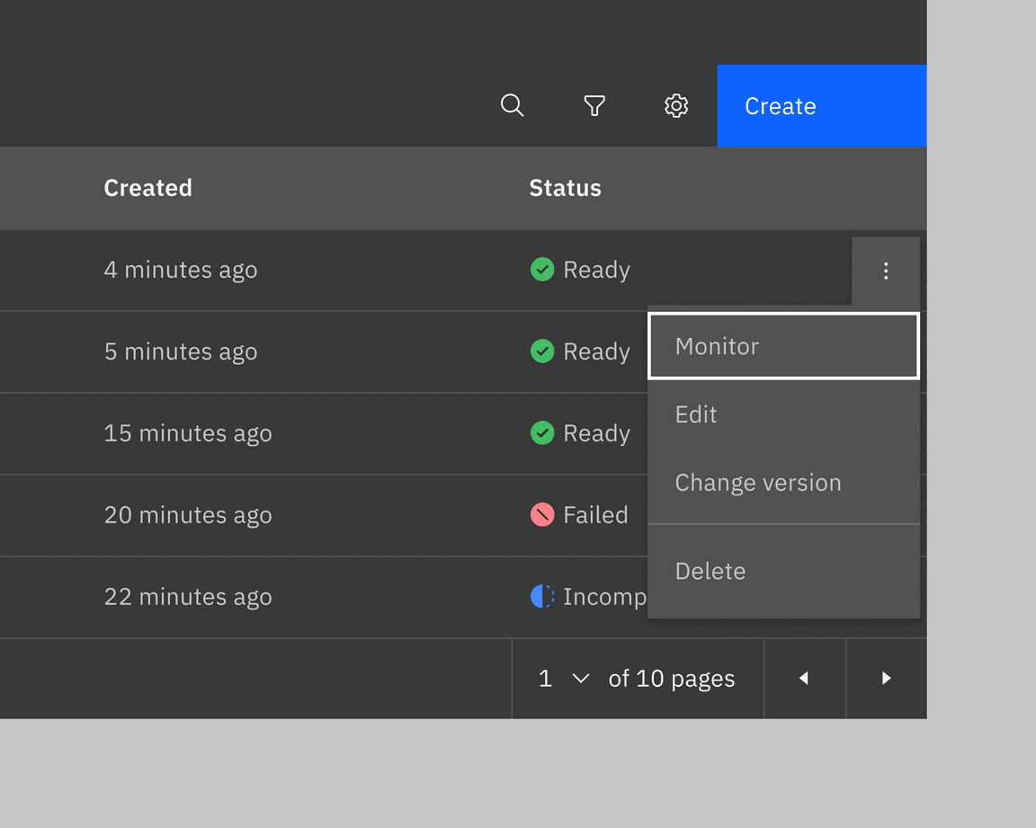
When actions affect a smaller proportion of a page, such as table rows or cards, use an overflow menu.
Content
Main elements
Label
The text label of the button is important to communicate the action that is triggered when the user interacts with it. The text label must accurately describe the button action or indicate that interacting with it displays a list of possible actions.
Further guidance
For further content guidance, see Carbon’s content guidelines.
Universal behaviors
States
The default and interactive states of menu buttons should follow the button style guidelines.
- Combo buttons are available only as primary buttons.
- Menu buttons come in three different button types: primary, tertiary, and ghost.
- The icon button of overflow menu is treated as the ghost button, displaying only an icon and following its designated color and style.
Interactions
Menu button
Users can reveal the menu by:
- Clicking anywhere on the container of a menu button
- Or tabbing into the menu button and pressing
ReturnorEnter
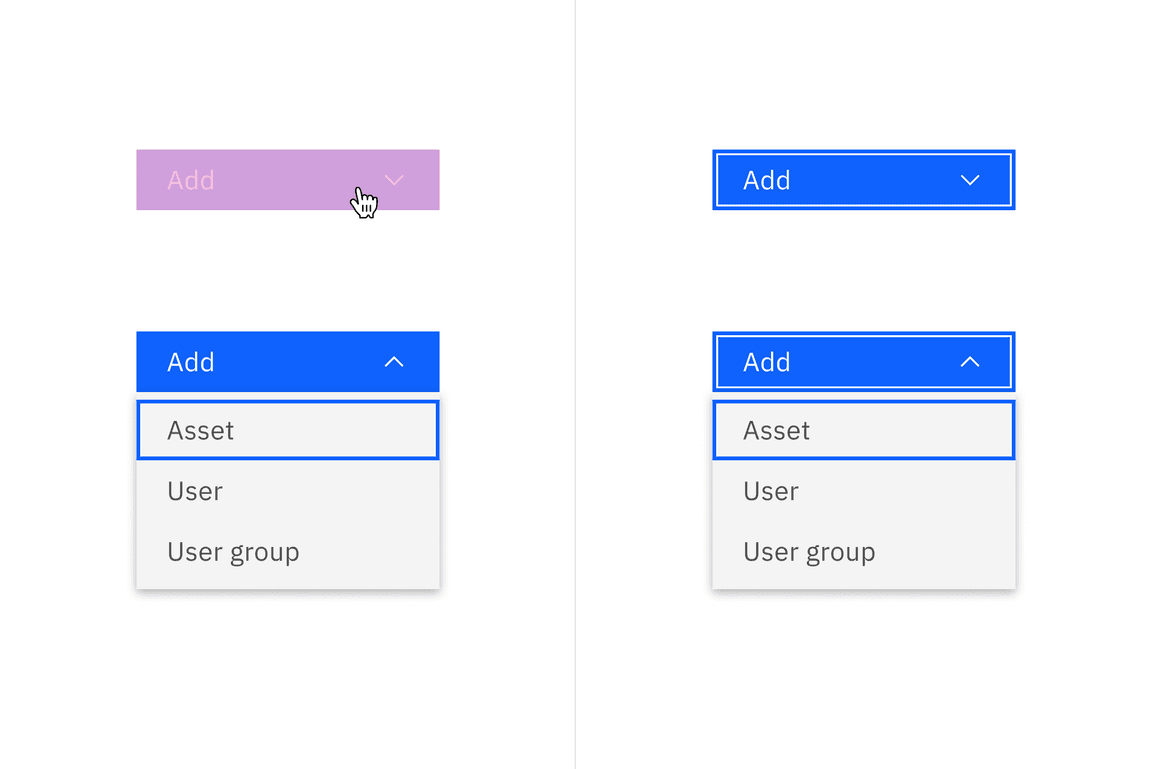
Mouse and keyboard interactions for menu button
Combo button
Users can reveal the menu by:
- Clicking anywhere on the container of the primary button or the icon button. If clicking on the primary button, this will apply to certain elements, depending on user interaction.
- Or tabbing into the combo button which will focus on the primary button first
then the icon button. Then, pressing the
ReturnorEnterto trigger the action of the primary button or menu under the icon button.
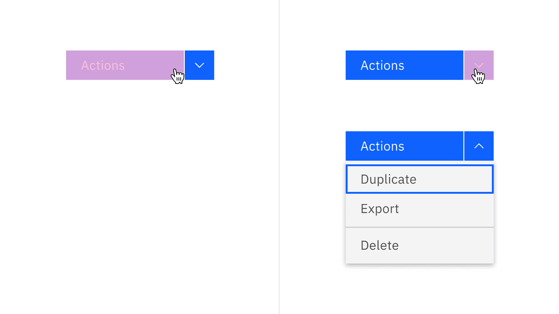
Mouse interactions for combo button
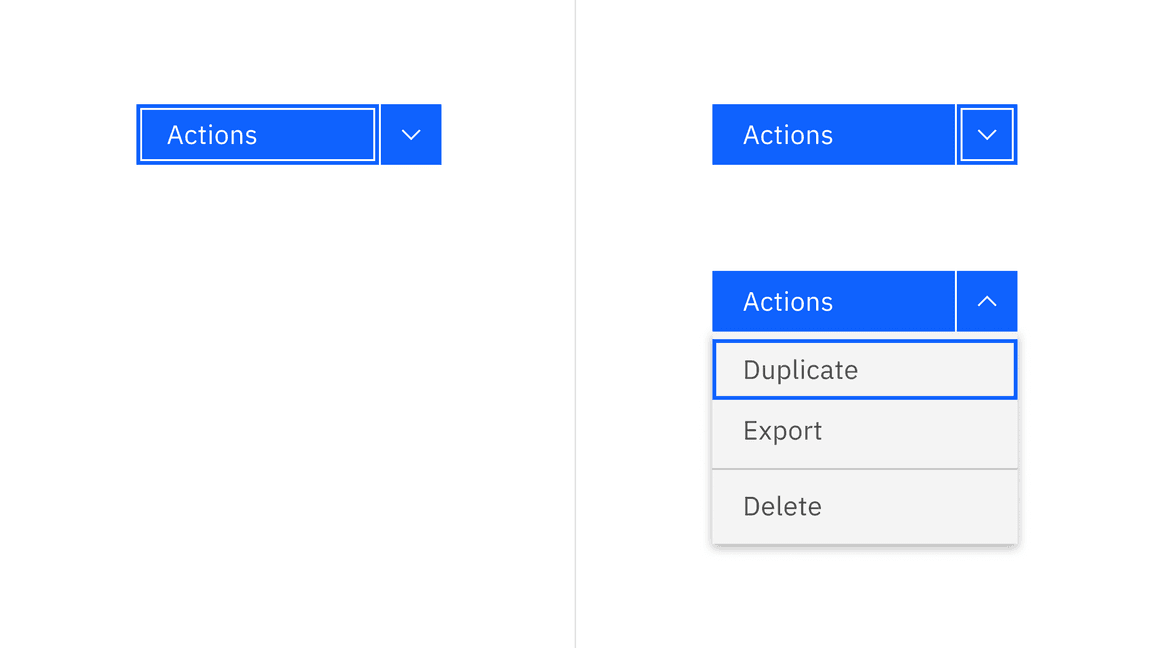
Keyboard interactions for combo button
Overflow menu
Users can reveal the overflow menu by:
- Clicking anywhere on the container of the icon button
- Or tabbing into the icon button and pressing
ReturnorEnter
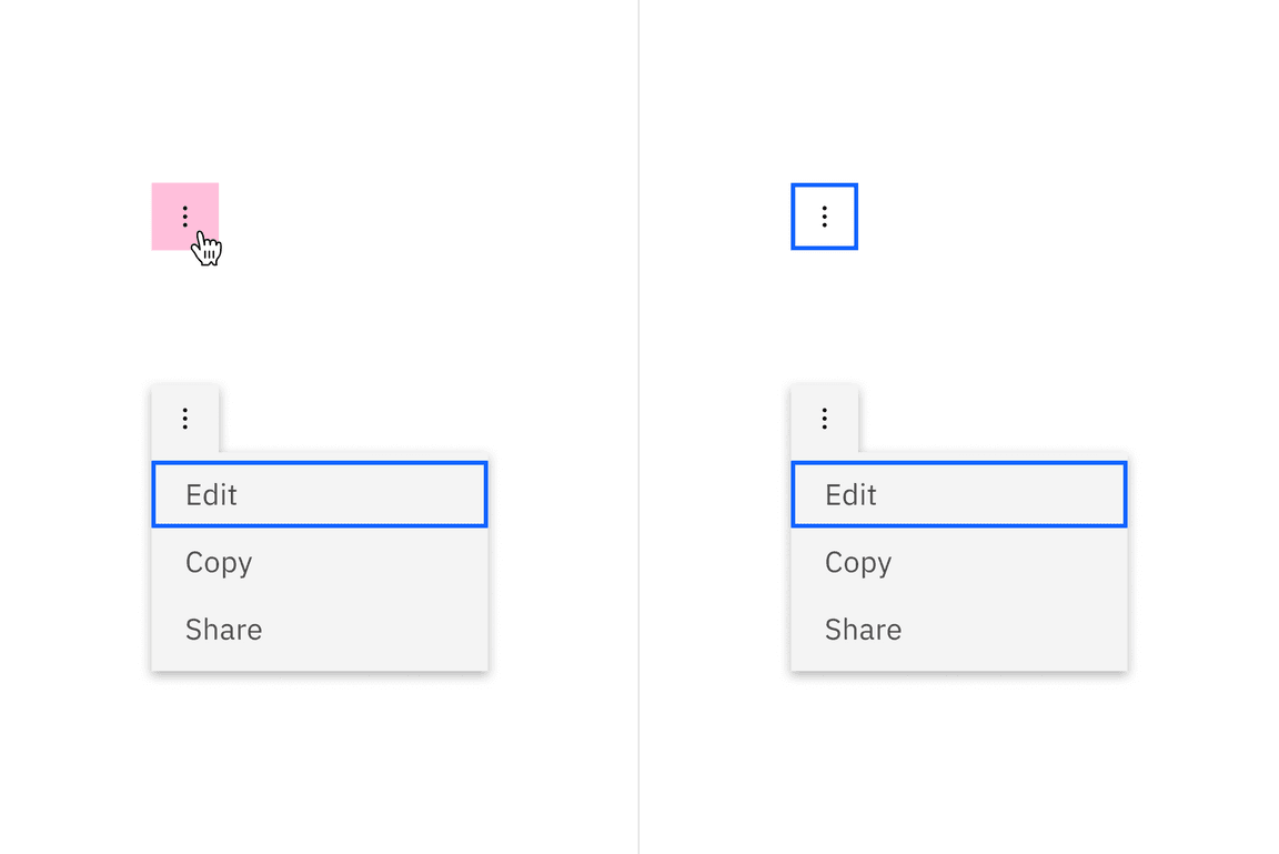
Keyboard interactions for overflow menu
Menu button
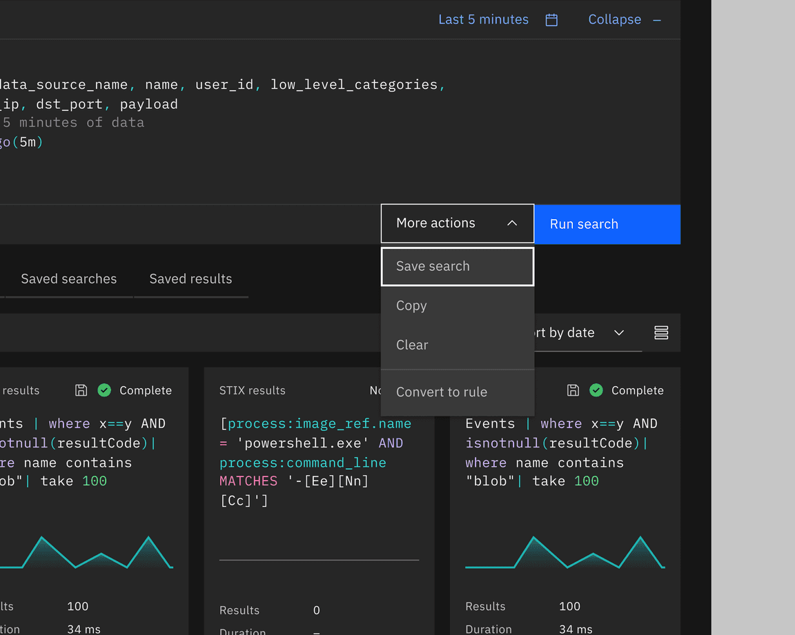
Menu buttons group actions that share the same level of importance. The icon used within the menu button should always be a caret in order to visually convey to the user that there are options to select from. There are three main use cases where using a menu button is recommended:
- Grouping objects with the same common action
- Actions related to a common label
- Distinct actions applied to the same object or page
Menu button and combo button come in three different button types: primary, tertiary, and ghost.
Best practices
Grouping objects with the same common action
Menu buttons are effective when a single action affects multiple distinct objects. This is particularly applicable when users need to Create or Add various objects, and all these objects are equally relevant options.
The shared action should not be repeated in the menu list. This adds unnecessary clutter and makes each option less distinct at a glance.
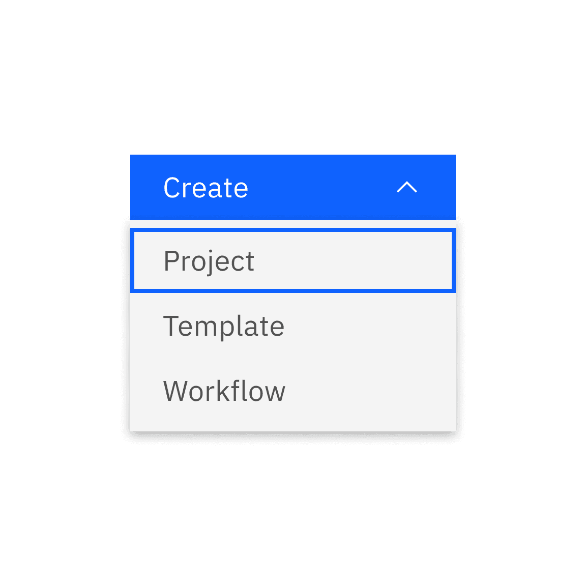
Do add distinct items for the action
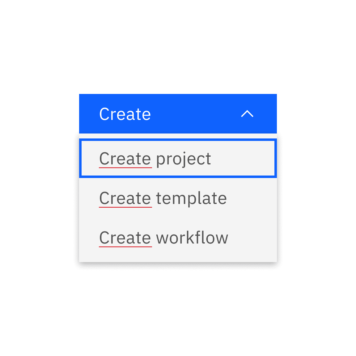
Do not repeat the action in the action item
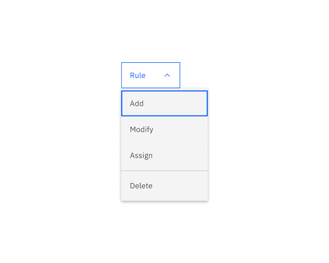
Actions associated with a shared label
Another common use of a menu button is grouping actions related to a common label. An example of this is when users have multiple approaches to execute an action, all of which are presented as choices within the menu button.
Distinct actions applied to the same object or page
In many cases, actions on a page may not use the same verb or have a shared label for the menu button. When grouped actions remain distinct, consider labeling the menu button as ‘Actions’ to encompass all available choices.
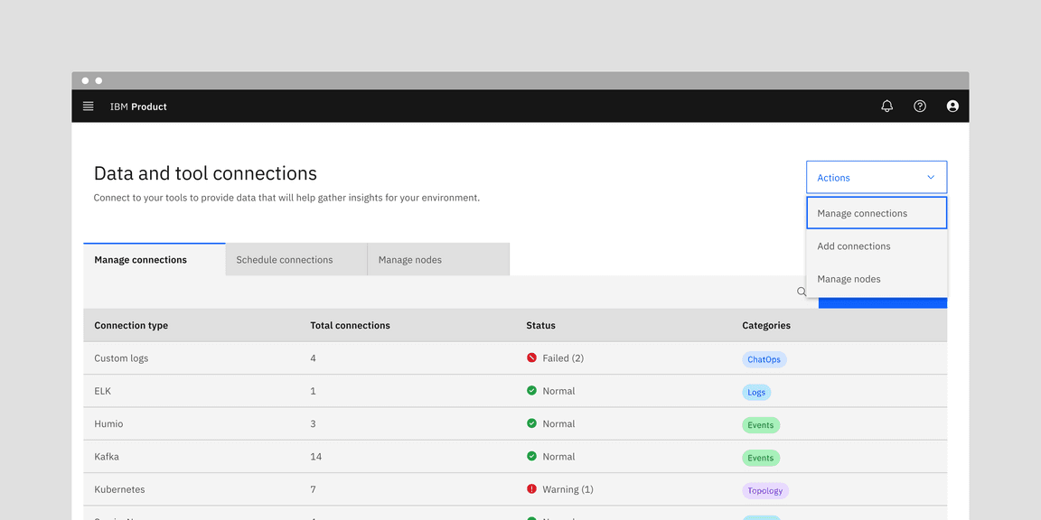
Example shows the menu button with possible actions that could influence the data within tab contents
Combo button
A combo button is composed of two buttons: the left is the default option (the most commonly used selection), and the right (chevron icon) shows the rest of the available options. A combo button provides quick access to a default action while also offering a list of related actions or options.
The combo button is expected to have less use than the menu button, as the additional actions are more hidden than they would be in menu button. However, this button does have particular use where screen real estate is limited and one of the actions has particular importance.
Combo button has only one button type: primary.
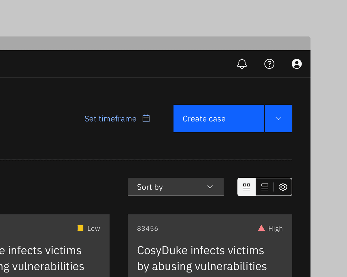
Best practices
Choose a default action
Remember to choose the default, primary action that will be displayed in the primary button so it is not hidden within the menu of additional actions. The primary default action is typically the most commonly used action there is to take.
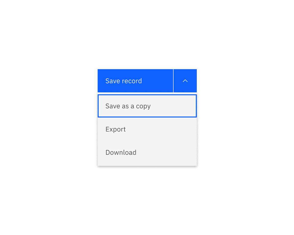
Example shows that users mostly choose to save records, while less common options are hidden as extra actions.
Reduce visual complexity on a page
Combo buttons reduce visual complexity by grouping similar commands together. For example, how navigation menus group together related options to enable conceptual understanding of the site information structure.
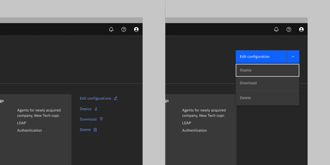
Example shows that many actions (ghost buttons) applying to the same data can be replaced by the combo button.
Overflow menu
Overflow menu is also another option that is available to the user when there is a space constraint, usually used in data table rows or in cards. Overflow menu has the ghost button style only.
Best practices
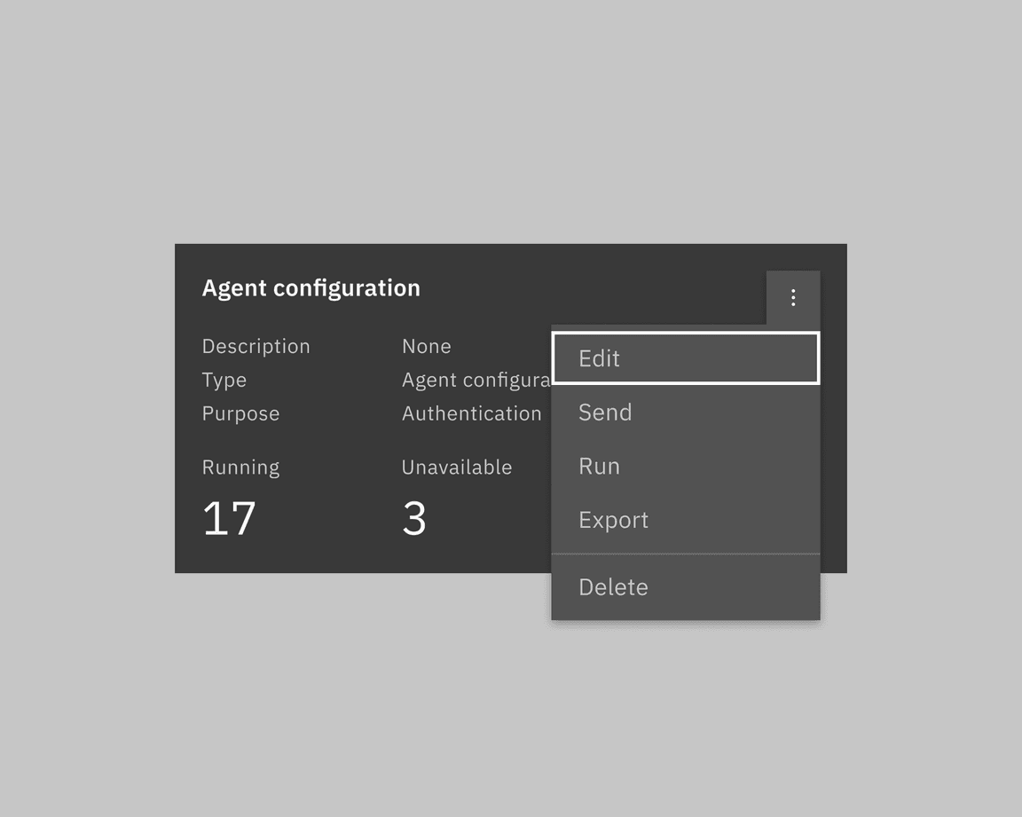
Overflow menu in cards
When there are more than three interactive icons, consider moving less important ones into the overflow menu. The overflow menu then takes the place of a third action.
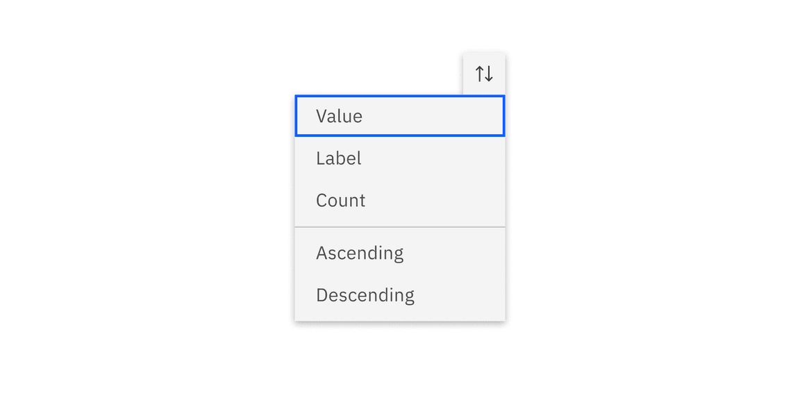
Overflow menu icon
The overflow icon can be customized to align with the product’s requirements. However, it’s advisable to make minimal changes to the overflow menu’s icon to maintain consistency across the product and ensure a consistent user experience.
Overflow versus tab tip (popover)
Overflow menu displays extra options with simple text, typically utilized within data table rows or cards. The tab tip popover allows the user to include more complex inputs such as a checkbox group or a radio button group, usually connected to a data table toolbar.
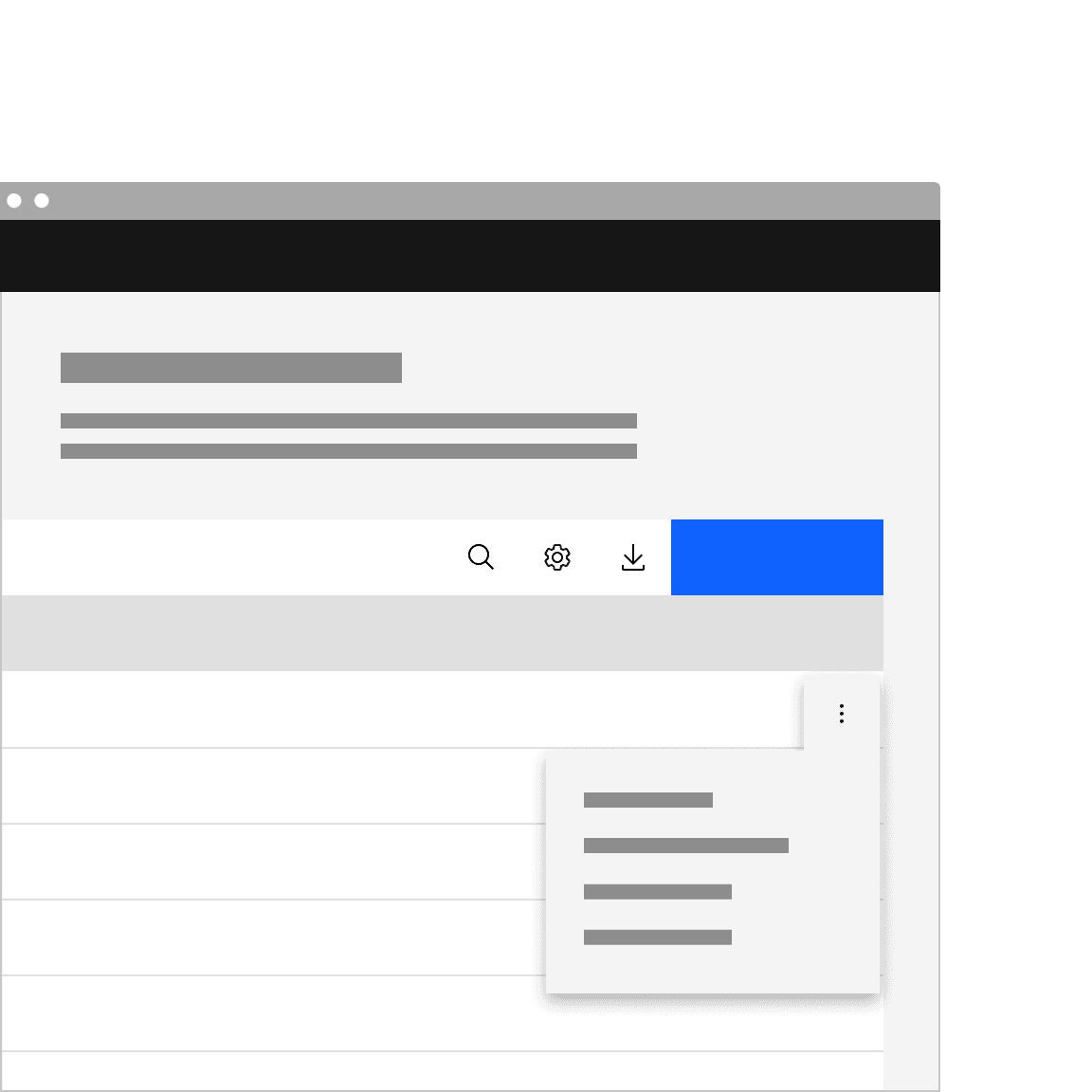
Use overflow menus in data table row
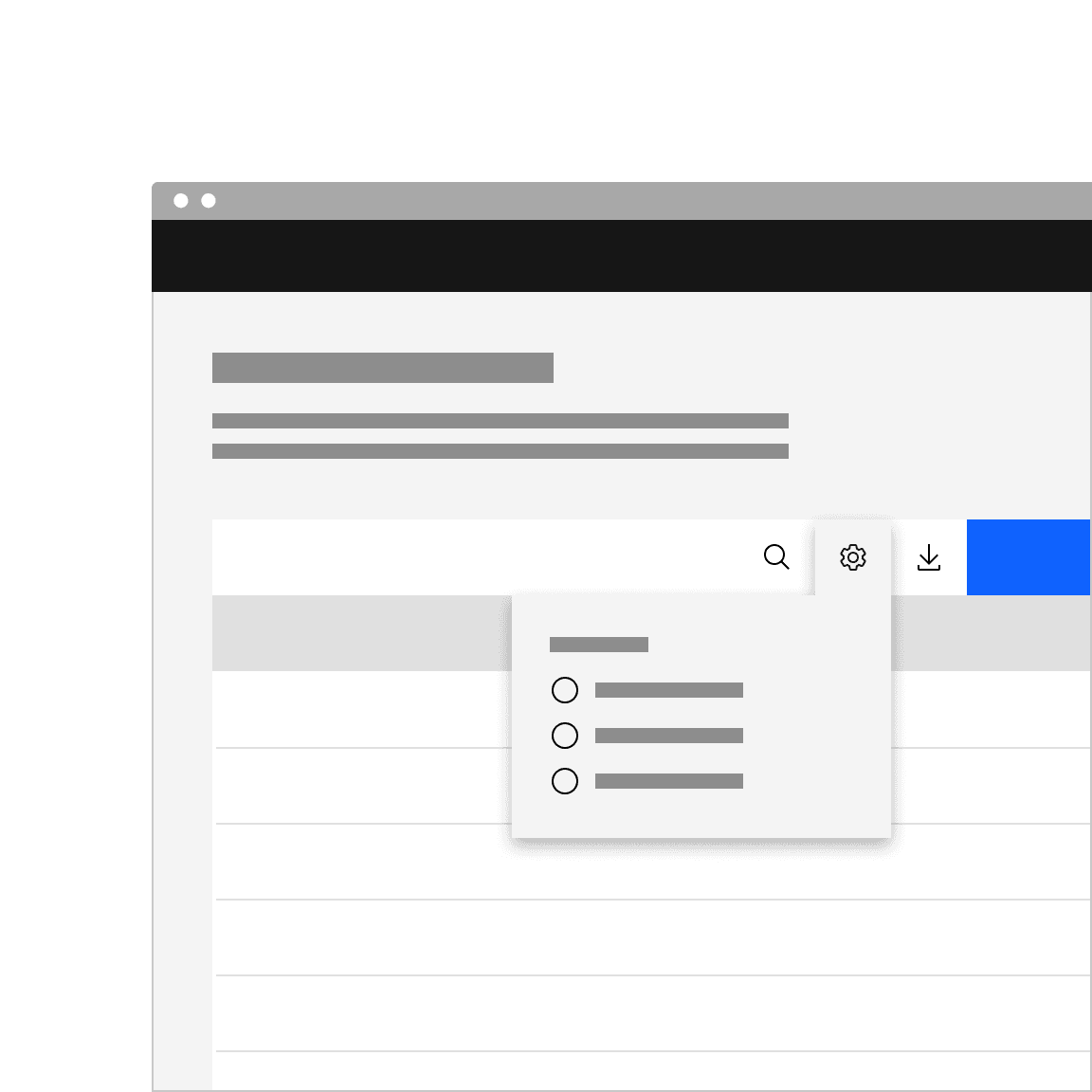
Use a popover in the data table toolbar
Related
Menu
To learn more about the details of how to use the menu component correctly, see menu buttons.
Dropdown
To understand how the menu component can be used differently from the dropdown component, see dropdown.
Popover
The popover component is visually similar to menu, but is used for different purposes. See popover for more information.
References
Anna Kaley, Contextual Menus: Delivering Relevant Tools for Tasks (Nielsen Norman Group, 2019)
Page Laubheimer, Split Buttons: Definition (Nielsen Norman Group, 2019)
Feedback
Help us improve this component by providing feedback, asking questions, and leaving any other comments on GitHub.